Widget & embedding
Style the chat widget and add it to your site with a script tag, an inline iframe, or the React SDK
The widget is the chat bubble visitors use to talk to your support agent. Each project has its own widget: style it on the Widget tab of your project's settings, then install it with one of the options below.
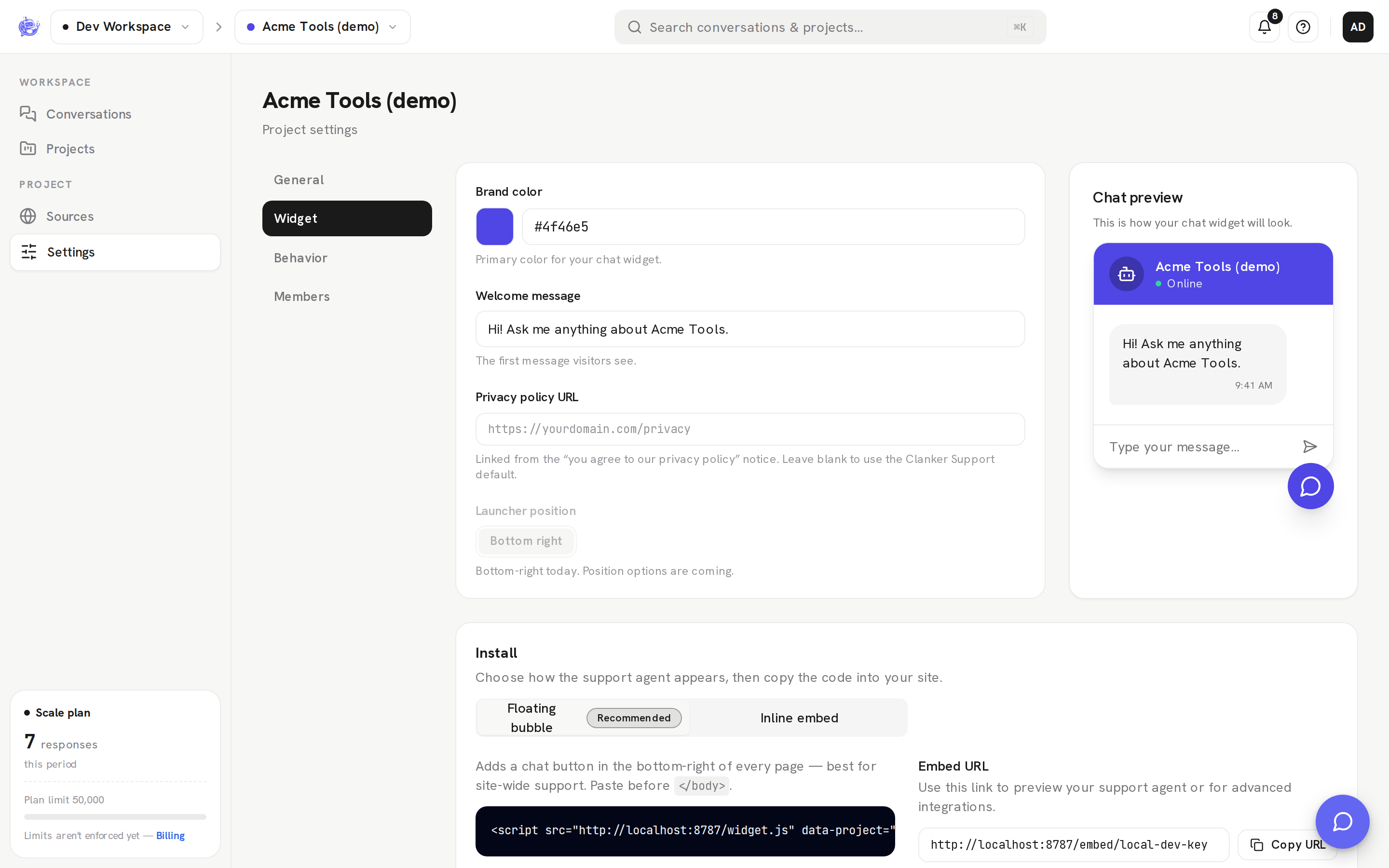
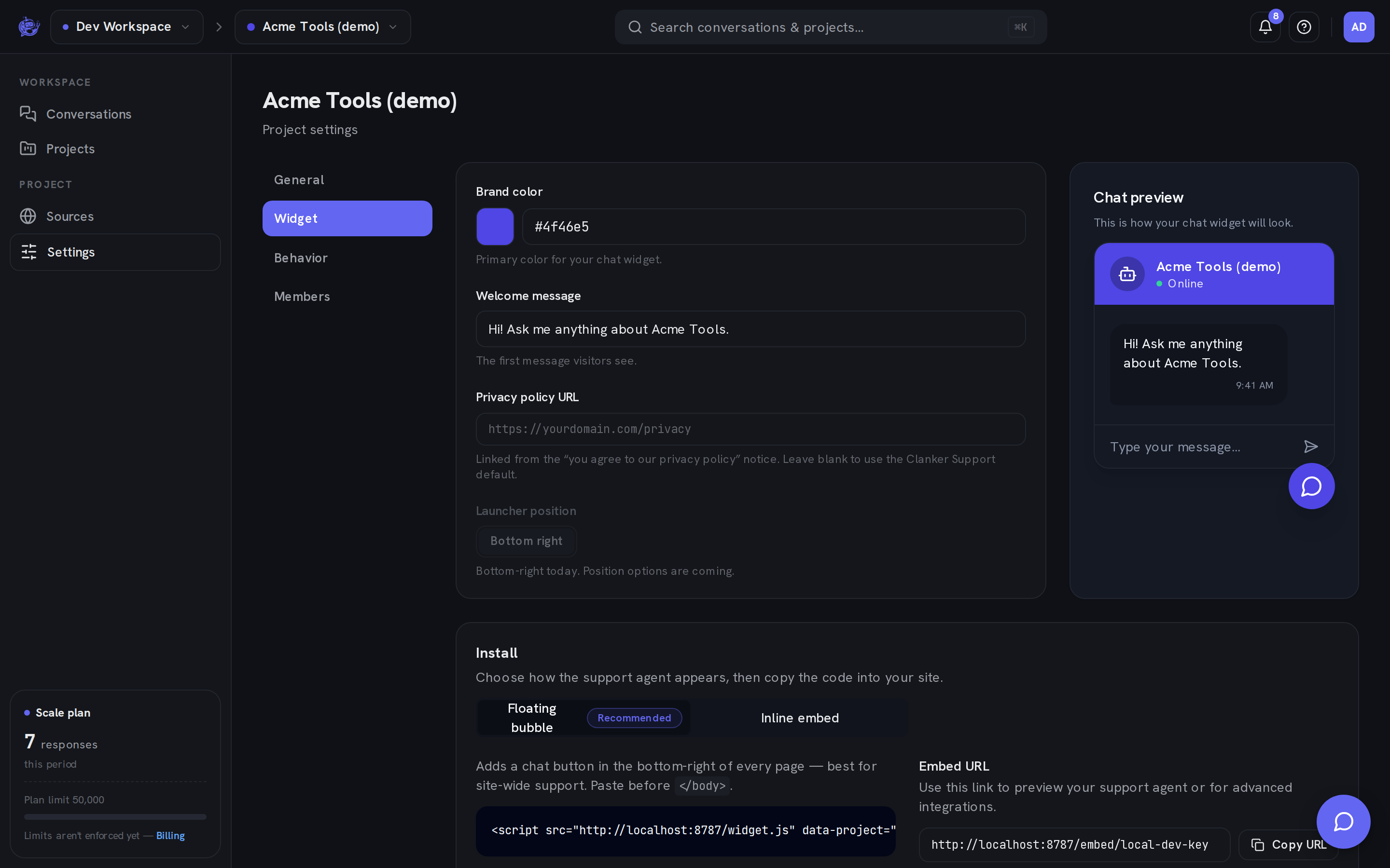
Appearance
| Field | What it does | | ---------------------- | --------------------------------------------------------------------------------------------------------------------------------------------------------------------------------------------------------------------------------------------------------------- | | Brand color | The widget's accent color — pick from the swatch or enter a hex value | | Agent photo | A photo or logo shown on the launcher bubble and the chat header, so the widget carries your team's face. Upload one (it's downscaled and stored with your project) or paste an image URL; an uploaded photo takes precedence. Remove both for the default icon | | Welcome message | The first message visitors see when they open the chat — also shown as floating teaser bubbles above the closed launcher (each line becomes its own bubble, up to two) | | Privacy policy URL | Linked from the privacy notice shown to visitors; leave blank to use the Clanker Support default |
The live preview beside the form updates as you type; use the save bar to apply your changes. The launcher sits in the bottom-right corner — position options are marked coming soon in the UI.
Install options
The Install section on the same tab generates copy-paste code with your project's public key already filled in. Toggle between Floating bubble (recommended) and Inline embed.
Floating bubble (script tag)
One script tag adds the launcher to every page it's on. Paste it just before the closing </body> tag:
<script
	src="https://api.clankersupport.com/widget.js"
	data-project="pk_your_project_key"
	data-api="https://api.clankersupport.com"
	data-brand="#6366f1"
	async
></script>
| Attribute | Required | What it does |
| -------------- | -------- | -------------------------------------------------------------------------------------------------------------------------------------------- |
| data-project | Yes | Your project's public key — safe to expose, it only identifies the widget |
| data-api | No | API origin; defaults to the origin the script was loaded from |
| data-brand | No | Accent color; the dashboard snippet fills in your project's brand color |
| data-avatar | No | URL of an agent photo or logo shown on the launcher bubble and chat header; the dashboard's Agent photo setting overrides it once loaded |
| data-teaser | No | Set to off to disable the proactive teaser bubbles that appear above the closed launcher |
Inline embed (iframe)
To fix the chat in a specific spot instead — a contact page, a help center — use the iframe embed:
<iframe
	src="https://api.clankersupport.com/embed/pk_your_project_key"
	width="400"
	height="600"
	title="Support chat"
	style="border: 0; border-radius: 12px;"
	allow="clipboard-write"
	loading="lazy"
></iframe>
The src is the Embed URL shown next to the snippet: a full-page chat you can also open directly (Open preview) to try your agent before installing anything.
React / Next.js SDK
For React apps, install the official SDK — it requires React 19 (Next.js 15+ App Router, or any RSC framework):
npm install @clankersupport/widget-rsc
Add one Server Component to your root layout:
import { ClankerSupport } from "@clankersupport/widget-rsc";

export default function RootLayout({ children }) {
	return (
		<html lang="en">
			<body>
				{children}
				<ClankerSupport apiKey="pk_your_project_key" />
			</body>
		</html>
	);
}
The component prefetches your widget config on the server and streams in without blocking the page. It renders plain, namespaced markup — no shadow DOM — so you can restyle it from your own stylesheet via the .clanker-* classes and --clanker-* CSS variables:
.clanker-root {
	--clanker-brand: #16a34a;
	--clanker-surface: #0b0f14;
}
For a fully custom UI, @clankersupport/widget-rsc/headless exports unstyled primitives (Root, Trigger, Panel, Messages, Composer, EscalateButton, …) and a useClankerSupport() hook that exposes the whole conversation — messages, streaming status, send(), escalation, ratings. The same entry also ships a client-rendered ClankerSupportWidget, the identical styled widget for Client Components and non-RSC React apps.
What visitors experience
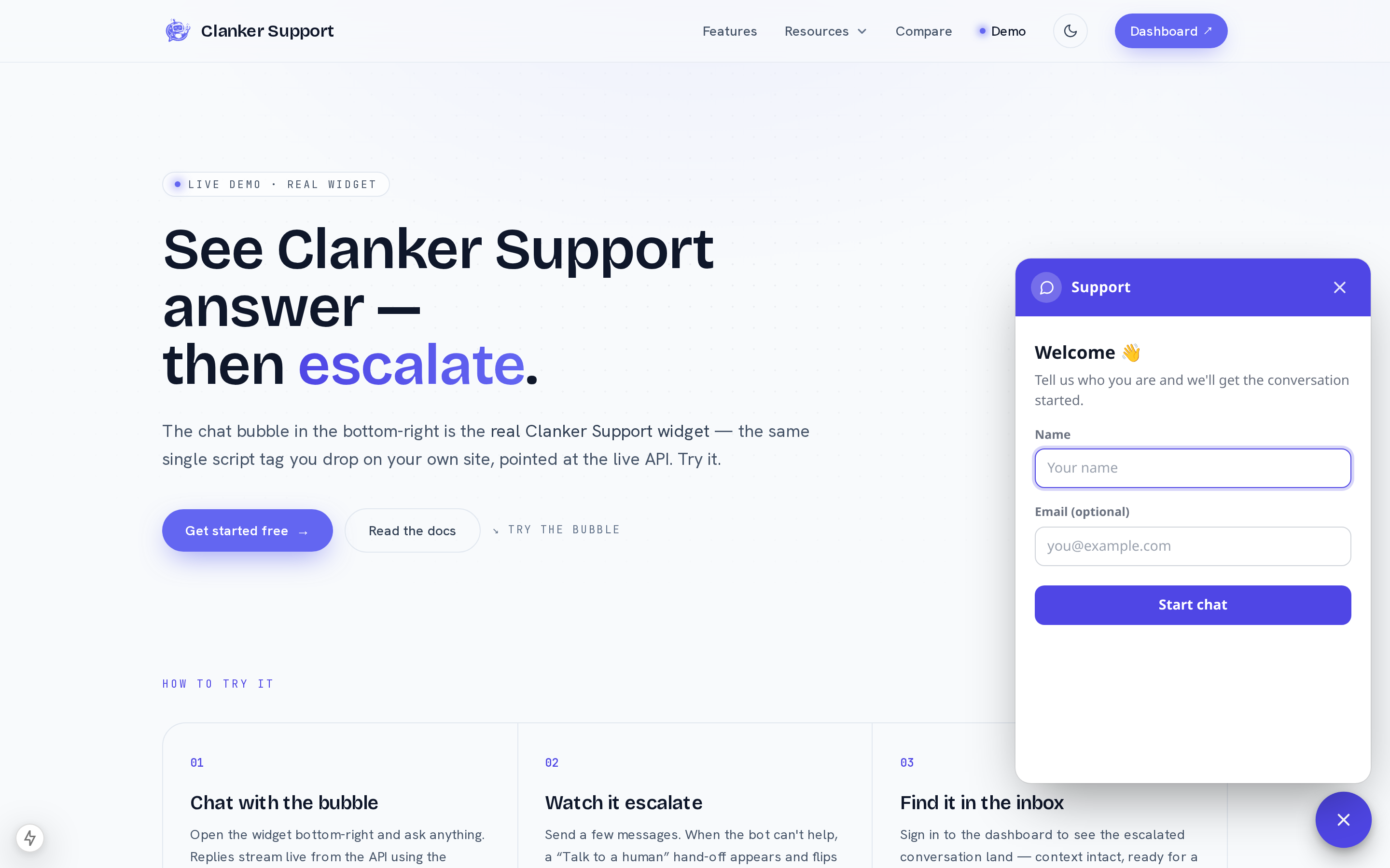
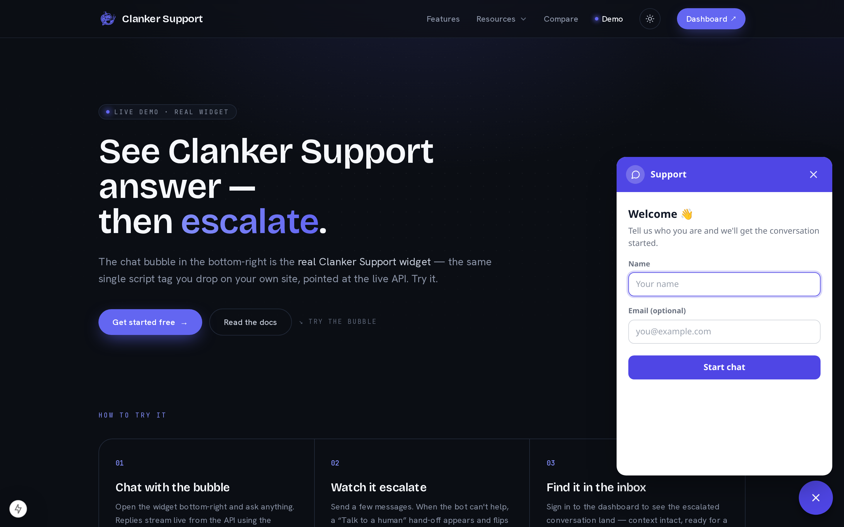
- A few seconds after the page loads, the closed launcher shows your welcome message as small teaser bubbles inviting the visitor in. Clicking one opens the chat; dismissing them (or opening the chat any other way) hides them for the rest of the browser session, and returning visitors with an open conversation never see them.
- Visitors give a name before chatting; sharing an email is optional, but with one your team's replies also reach them by email.
- Answers stream in from your knowledge base, with markdown formatting and a thumbs up/down on each AI answer.
- When a visitor asks for a human, the widget shows a recap of the handoff and the agent stands down — it sends a brief holding note, then goes quiet once a human replies. See Escalation.
- Replies your team sends from the inbox appear in the widget automatically.
- Visitors can mark their own conversation resolved, and can leave a 1–5 rating when closing the chat.
Voice calls
On the Scale plan, the widget can also offer live voice calls: visitors tap the call button and talk to the same support agent, grounded in the same instructions and knowledge base as the written chat.
A few things worth knowing as an operator:
- Audio streams in real time and never touches our servers. The call runs directly between the visitor's browser and the realtime model provider; Clanker Support only issues a short-lived call credential and never receives or stores the audio. When a call starts, a system note appears in the conversation thread so your team knows it happened.
- Calls are transcribed into the conversation. When a call ends, a text transcript of what was said (visitor and agent turns, in order) is saved into the same conversation thread — so escalations, email follow-ups, and inbox triage have the full context of the call. The transcript text comes from the realtime provider's speech-to-text; the audio itself is still never stored.
- Voice-enabled knowledge is visitor-visible. Starting a call delivers your project's assembled prompt, knowledge, and sources to the caller's browser to configure the realtime session — treat any knowledge on a voice-enabled project as visible to visitors, and keep anything you wouldn't show a visitor out of it.
- Voice condenses your knowledge. Realtime voice models accept a much smaller instruction budget than written chat: the upstream limit is 16,384 tokens for the entire prompt, so calls keep an estimated ceiling of about 12,000 tokens under it. For voice, knowledge text is capped at 8,000 characters and reference sources share a 16,000-character budget; if the combined prompt is still over the ceiling, it is trimmed from the end when the call starts. Written chat always uses the full budgets — if voice matters to you, keep the prompt and knowledge for that project concise, and put the essentials first.
- Calls are budgeted. Voice sessions are limited per visitor network (4 calls/hour per IP address), per project (20/day), and per workspace (100/day), and each session is capped in duration and spend. If a visitor hits a limit, the widget falls back to the written chat.